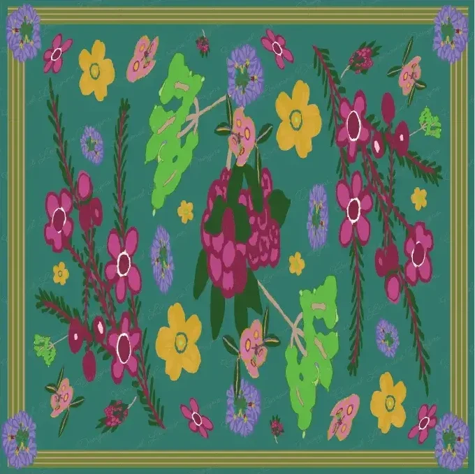
A Little Journey Through The Studio Shelf — And My Evolving Colour Story
Hi friends,
It has been a little while since I shared a blog post, so I thought I would take you behind the scenes of The Studio Shelf — the place where I keep some of my earliest collections.
These were the designs that began my surface pattern journey. Looking back at them now, I can see how much they reflect the colours I was drawn to at that time.
Many of those early collections feature soft blues, greens, and gentle complementary colours. They were influenced by the landscapes around me and the colours I noticed in everyday life — the greens of the hills near Perth, the changing skies, and the natural tones that surrounded me.
Although my work has continued to evolve, those early designs still represent an important part of my creative journey.
Over time, I found myself naturally drawn towards warmer colours. Richer tones, deeper contrasts, and palettes that felt more connected to the way I see colour now.
This is where my Deep Autumn palette began to emerge — burgundy, saffron yellow, chocolate brown, denim blues, warm navy, avocado green, jade, warm pinks, lilacs, and soft whites.
These colours feel familiar to me. They remind me of autumn gardens, changing seasons, warm fabrics, ripening fruit, and the colours that appear around us as the year moves along.
I think part of the reason I connect so strongly with these tones is because they are also the colours I naturally choose in my own life. My wardrobe reflects this palette, and over time I noticed that my artwork began to do the same.
The things around us often influence what we create, and for me, colour is one of the strongest connections between everyday life and my artwork.
I am also interested in exploring how this palette could translate into warmer seasons — lighter colours that still have the warmth I love. Perhaps soft whites, gentle golds, faded pinks, and clear summer blues.
It will be interesting to see where that idea leads.
Whether you are drawn to the softer blues and greens of my early collections or the richer tones that have become part of my current work, I hope you enjoy exploring The Studio Shelf.
It is a collection of designs from an earlier chapter of Carmel Lorraine Designs, and I am grateful to be able to share where the journey began.
Thanks so much for being here.
Stella x
P.S. If you would like to explore The Studio Shelf, you can subscribe anytime. Members have access to my first collections, along with any new designs I add over time.
